KORIDOR
Mobile App
Creating a native mobile presence based on the current web app.

OVERVIEW
myRoom© affords the hotel guest the opportunity to self-select or upgrade their room prior to arrival (up to a year in advance) through the use interactive floor plans, room-specific imagery, room features and exterior room views. myRoom© is used by external people (in addition to a few admin/internal teams).
My Role
Product designer- My responsibility included creating all significant artifacts and deliverables, in addition to establishing the groundwork for the design system.


The Goal
The goal for this project is to create an exceptional user experience that seamlessly blends functionality, aesthetics and ease of use. This project aims to optimize every aspect of the apps interface and interactions to enhance user satisfactions, engagement and ultimately drive upgrades or add ons. The native mobile app was considered a phase 2 part of the overall companies vision but upper management/stakeholders wanted to get a jump on this phase.
MY APPROACH
I gathered information from our product team and C-level members to help understand their vision and how I can align them to the overall business objectives. For me this would include research on any market competition and their approaches, research on similar features as well as design principles. Since we had a responsive web app already in place with several clients, I checked with customer service to verify any pain points and or what the customers wants/needs were.
Koridor is an extremely small company, I interviewed the CEO and the VP of Product Management to better understand the product flows, personas and some initial UX pain points.
Competitor Analysis
During research phase, we found that the only other tool like this on the market was builtin to Hilton's app, where the user would book there room and within 24 hrs of arrival to the hotel, the user could select a room of their choice (based on the type of room they booked).

User Research
I created a couple of personas to help with identify needs and painpoints. These personas were generated based on simple interview questioning and empathy mapping.


Clear Personas rose from the simple UX research and empathy mapping.
From research I started on building a user flow that would have 2 paths: New Customer or Returning Customer. Once the flow was signed off, I proceeded to build wireframes that correlates to the flow.
User Flow

User flow generated in Whimsical for both scenarios (New vs Returning Customer)
Once sign off from the user flows was established, I proceeded to build the wireframes. Below are some of the wireframes during the ideation phase.
WIREFRAMES


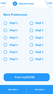


Basic Wireframes that were utilized for user testing
USER TESTING
After the ideation phase, I enlisted people to help walk through the app, trying to locate any pain points that may have come from design. Nothing was glaring, but a small concern did arise, and that was when the user was done selection the room and they were at the very end of the flow...what do they do then? At the time (from wireframes), I had not come up with an option for closure. So my solution (after collaboration with the team) was to give the user the option to go back and select a different room. Essentially having them go through the room selection process again or they could simply close the app. This was a marketing solution in a sense; the idea is that we give the user an opportunity to go back and potentially select an upgrade or some add-on (which was coming soon but not part of the MVP).

THE SOLUTION
After many meetings, touch-bases, updates, iterations, we landed on the final design below. This design was presented in a stakeholder's meeting and was well praised. Feedbacks were, "easy to read and follow", "good visuals".
Unfortunately, this project was shelved. With the rapid pace of changes, the investors of this startup was wanting quicker results without spending more money, so the decision was to take the web app that we had currently in place and expand upon it and making it mobile responsive (as oppose to investing into a Native app).


